SkillActor

SkillActor — Talent & Skill Management Platform
Project Type: SaaS Platform / Web App
My Role: Full-stack development – Laravel backend, Vue.js frontend, custom admin dashboard, performance engineering
Live: skillactor.com
💡 Project Overview
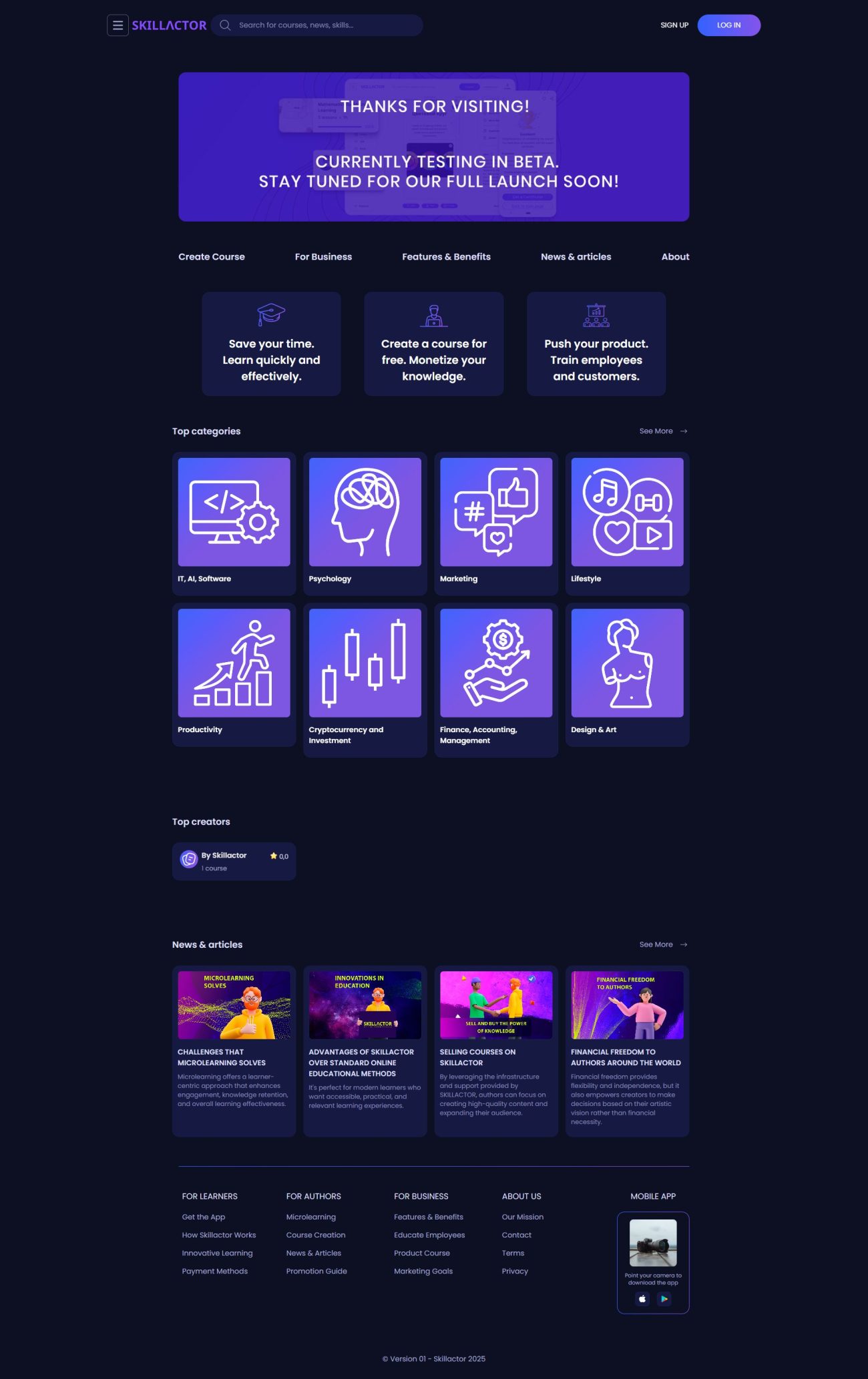
SkillActor is a talent and skills management platform designed for HR teams and enterprises to track, assess, and manage employee competencies. The goal was to deliver a solid SaaS solution that supports large volumes of users, fast search, real-time data updates, and an intuitive admin interface.
🎯 Key Objectives
- Implement a multi-tenant SaaS architecture
- Enable fast and powerful search over profiles, skills, and assessments
- Build a dynamic, responsive admin area for HR managers
- Ensure real-time updates and efficient data caching
- Provide a scalable, maintainable solution with solid performance
🧰 Platform & Stack
- Backend: PHP, Laravel (API, authentication, business logic)
- Frontend: Vue.js SPA with Vue Router & Vuex
- Search: Elasticsearch for full-text and filter-based searches
- Cache: Redis for session storage, queue caching, and live updates
- Queue & Events: Laravel Queues and Events for background tasks and notifications
- Infrastructure: NGINX, MySQL, Redis, Elasticsearch, managed via Docker / CI pipelines
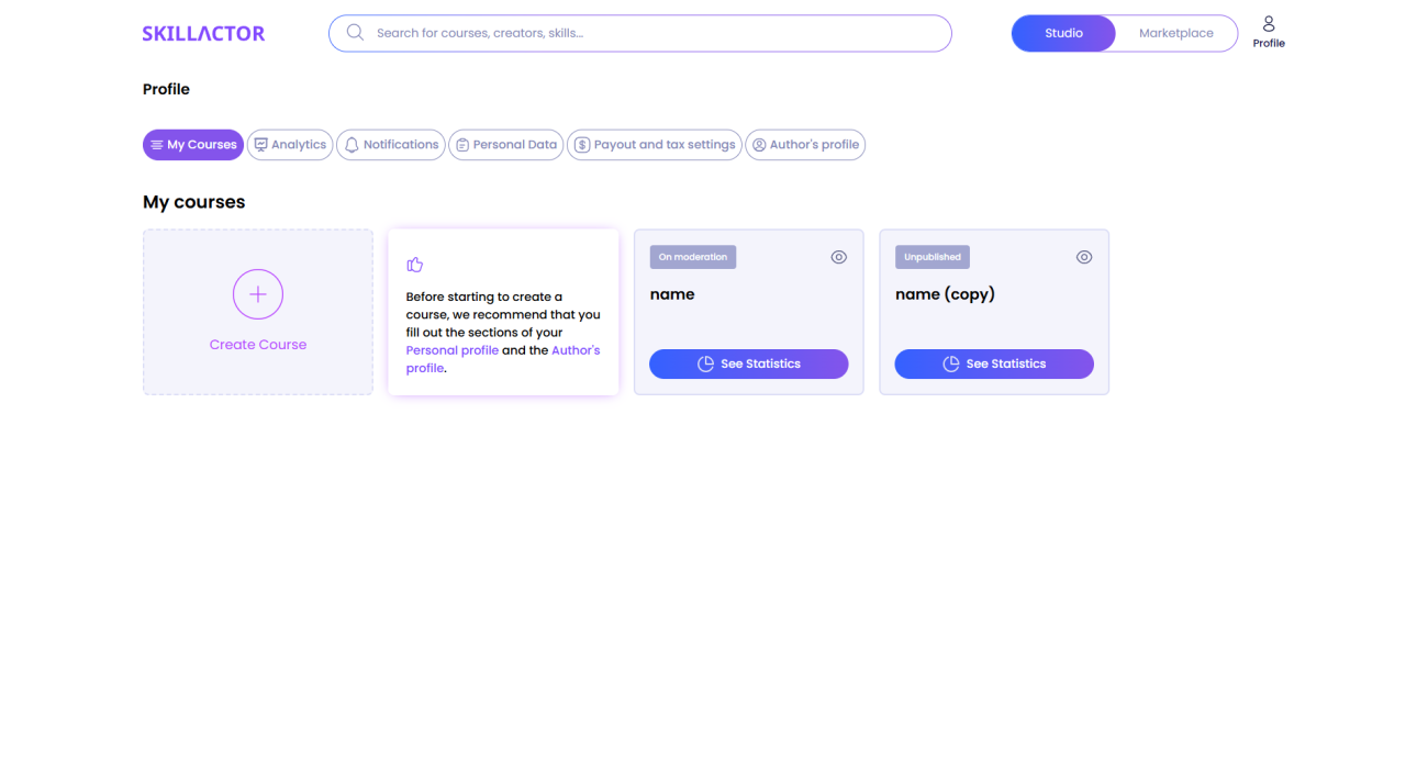
🔧 Custom Admin Area
- 👩💼 User & Tenant Management: Create/edit employee profiles, assign roles and permissions, manage teams
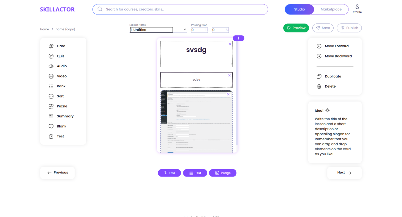
- 📋 Skills Matrix & Assessment Tools: define skills, attach ratings, track progress and certifications
- 🔍 Smart Search: using Elasticsearch, enable filter-by-skill, keyword, department, rating
- 📈 Reports & Analytics: Generate team competency charts and export CSV/PDF reports
- ⚙️ Settings: Manage tenancy, email notifications, caching, feature toggles
📈 Performance & Scaling
- Redis-powered caching for session and query speed
- Efficient asynchronous processing with queues (e.g., email, notifications)
- Elasticsearch-powered full-text search with faceted filtering
- Vue.js SPA dynamic loading of modules and assets
- Docker-based deployment with zero-downtime strategy via CI/CD
🚀 My Contributions
- Designed and implemented Laravel multi-tenant architecture
- Built Vue.js SPA with clean modular components and state management
- Integrated Elasticsearch to support lightning-fast search and filters
- Created Redis-accelerated cache and queue systems
- Developed the custom admin dashboard with detailed analytics and export tools
- Deployed and optimized the full stack—server setup, Docker orchestration, HTTPS, backups
✅ Results
The finished platform empowers HR teams with real-time insight into skill distribution, employee development paths, and reporting. Search and navigation operate instantly, even with large datasets. Admins enjoy an intuitive and powerful interface, while the backend is robust and scalable.
📩 Interested in a Similar Solution?
If you need a talent or skills management platform—built on Laravel + Vue, powered by Elasticsearch and Redis—drop me a message via contact form.
Mion.by — Online Store for Electrical & Lighting Equipment
Project Type: E-commerce Website (WordPress + WooCommerce)
My Role: Full-stack development, theme and plugin customization, performance optimization, UX improvements
Live: mion.by
💡 Project Overview
Mion.by is a Belarus-based B2B/B2C online store specializing in electrical and lighting products — including circuit breakers, LED lighting, panel assemblies, modular equipment, and industrial electrical accessories. The project required not only a solid online storefront but also a flexible admin system for managing complex inventory, pricing models, and technical specifications.
The site was built on WordPress with WooCommerce at its core, but extended heavily with custom plugins and bespoke solutions tailored to the client’s unique business logic.

🎯 Key Objectives
- Develop a scalable, maintainable e-commerce system for industrial product sales
- Ensure the site is user-friendly for both wholesale and retail visitors
- Implement fast and intuitive product filtering across a large catalog
- Optimize for mobile performance, SEO, and long-term content growth
- Give administrators powerful tools to manage products, stock, documents, and pricing
🧱 Platform & Stack
- CMS: WordPress
- E-commerce: WooCommerce (customized)
- Custom Plugins: bespoke product filters, attribute managers, importer tools
- Frontend: HTML5, CSS3 (SCSS), JavaScript, responsive grid system
- Backend: PHP, Woo REST API, WP Cron, custom database queries
- Infrastructure: NGINX, MySQL, GitHub Actions (CI/CD), Redis object cache
🔧 Features Developed
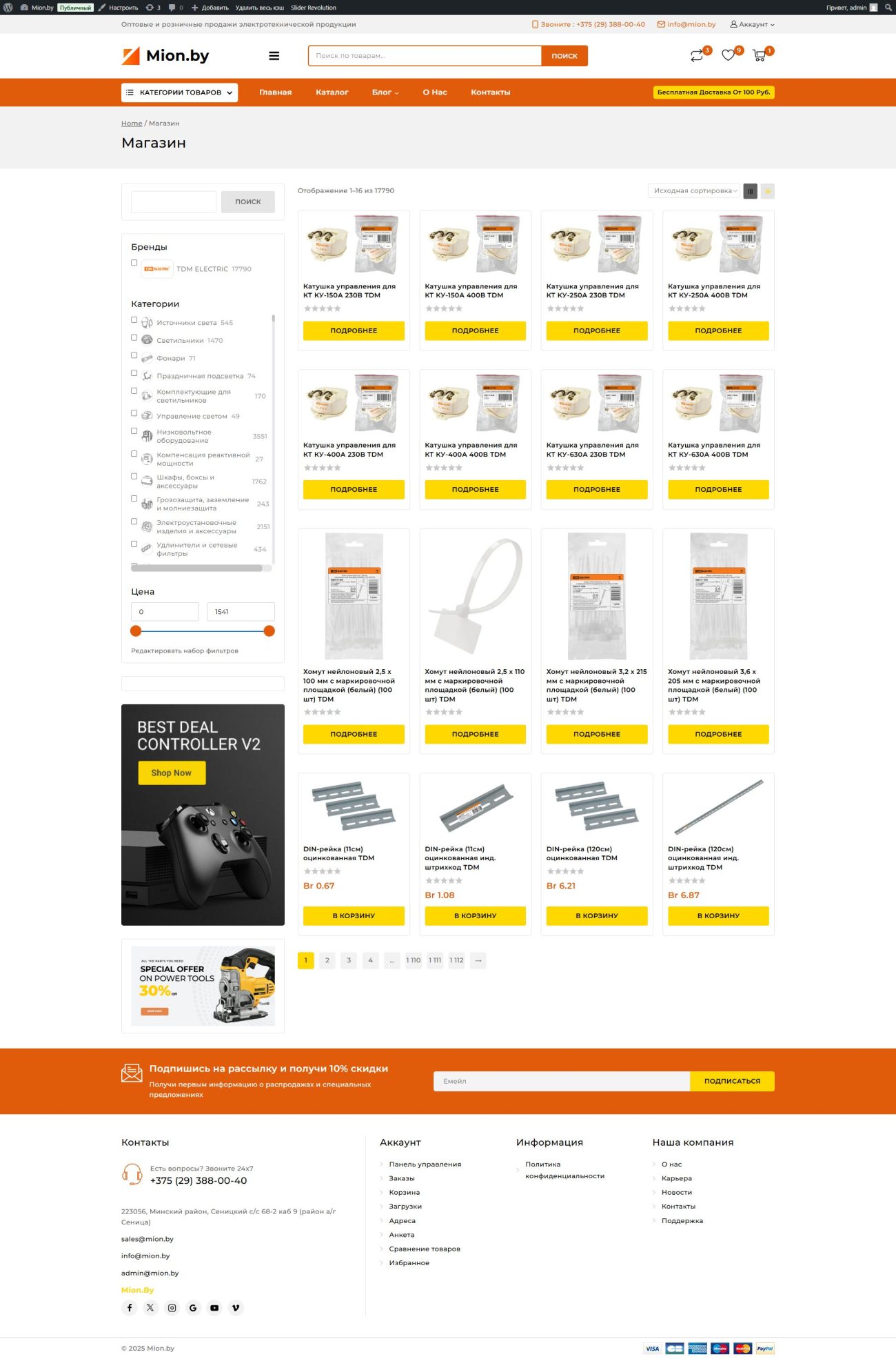
- ⚙️ Advanced Product Filtering: by power, voltage, application type, manufacturer, and other custom taxonomies
- 📄 PDF Datasheets: auto-linked to product specs, downloadable directly from product cards
- 📦 Product Importer: a custom-built tool to update inventory and stock from XLSX/CSV spreadsheets
- 📊 Price Tiers & B2B Logic: wholesale visibility, hidden prices until login, and user roles with custom pricing rules
- 🖼 Media Management: automated image compression, fallback preview icons, gallery with zoom
📂 Website Structure
- Home Page: key product categories, featured selections, search bar
- Product Catalog: nested category trees, filter sidebar, paginated results
- Product Pages: technical info tables, attachments, inquiry or purchase button
- Cart & Checkout: simplified flow with minimal friction and instant validation
- About / Services: info about the company, technical capabilities, delivery, and guarantees
- Contact: webform, address, phone, embedded Yandex/Map + email tracking
🧩 WooCommerce Customization Highlights
- Removed all unnecessary default WooCommerce markup and scripts
- Integrated custom fields for technical specs and extra document uploads
- Replaced standard filters with a smart taxonomy-based filtering engine
- Built lightweight templates for better performance (especially on mobile)
- Enhanced admin UI with metaboxes, validators, and import logs
🚀 Performance & Optimization
- Lazy-loading for images and script assets
- Custom pagination without full page reload (AJAX)
- Object caching via Redis for fast archive page loads
- SEO-optimized URLs, schema.org markup for products
- Optimized critical rendering path, CSS splitting for mobile/desktop
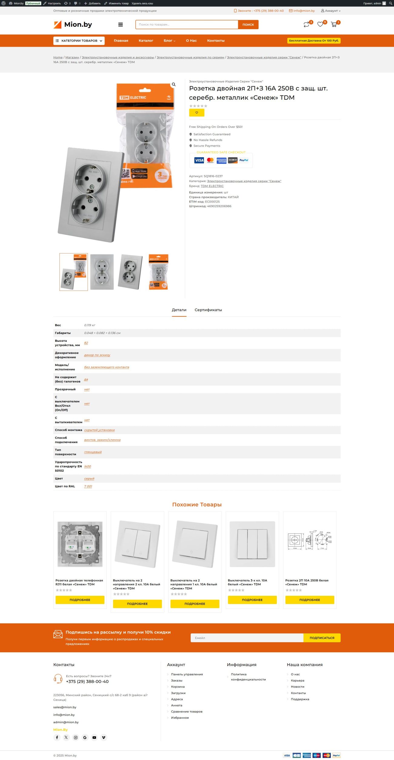
📈 Result
The result is a highly flexible, fast, and professional-looking online store tailored to the needs of an industrial supplier. Admins can manage a growing inventory of products with complex specifications, while users can find what they need quickly — from basic LED fixtures to technical power modules. The custom tools and streamlined WooCommerce base ensure long-term maintainability and scaling without sacrificing speed.
✉️ Want Something Similar?
If you’re looking to build a technical, product-heavy e-commerce website with advanced catalog logic — get in touch.
HK Devotion — Corporate Website for a Digital Agency
Project Type: Corporate Website
My Role: Full-stack development (frontend + backend), DevOps, architecture
Live: hkdevotion.com
💡 About the Project
HK Devotion is a modern digital agency offering comprehensive services — from UX consulting and full-stack development to AI, DevOps, and cloud architecture. The website had to reflect their technical depth, design clarity, and business focus — all while remaining minimalistic and fast.
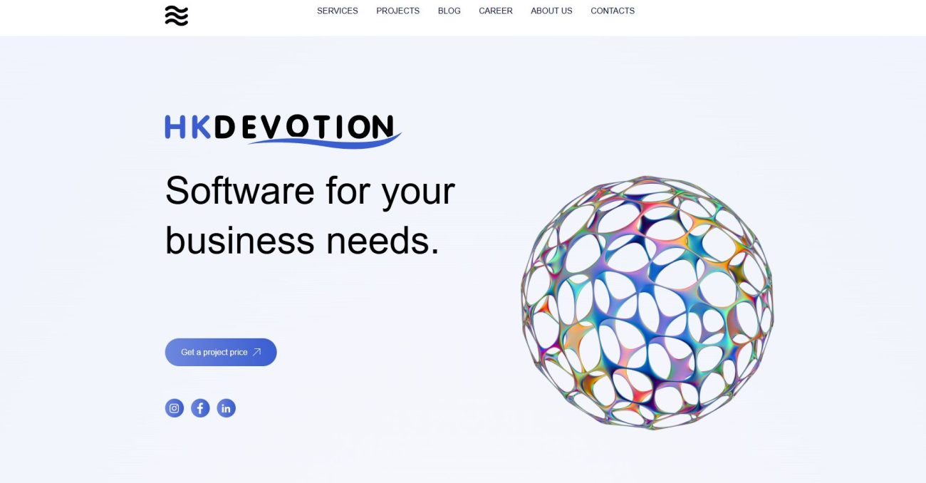
📐 Objective
Build a corporate site to showcase services and selected projects in a clean, responsive, and scalable layout. The site had to be CMS-friendly, optimized for SEO, and ready for future multilingual expansion.
🛠 Technologies
- Frontend: HTML5, CSS3, JavaScript, responsive layout, GSAP animations
- Backend: Headless CMS (Strapi), custom Node.js API, REST integrations
- DevOps: VPS hosting (NGINX), GitHub Actions CI/CD, backup routines
- Integrations: Google Analytics, CRM webhooks, contact forms
📂 Site Structure
- 🏠 Home
- 🧰 Services — interactive service cards
- 📁 Projects — case studies with filtering
- 📞 Contact — form with validation + Google Maps

📌 Featured Case Studies
Shopping Platform
E-commerce solution with advanced filters, ERP integration, and real-time stock updates.
Online SPA Store
A fast single-page application built with Vue.js, featuring cart, checkout, and dynamic routing.
Real Estate Portal
Platform for managing listings, leads, and documents for property developers.
🚀 What I Delivered
- Architecture & navigation planning
- Responsive frontend development
- Custom backend API + headless CMS setup
- Deployment, SEO, analytics & CRM integration
- CI/CD pipeline and server optimization
✅ Results
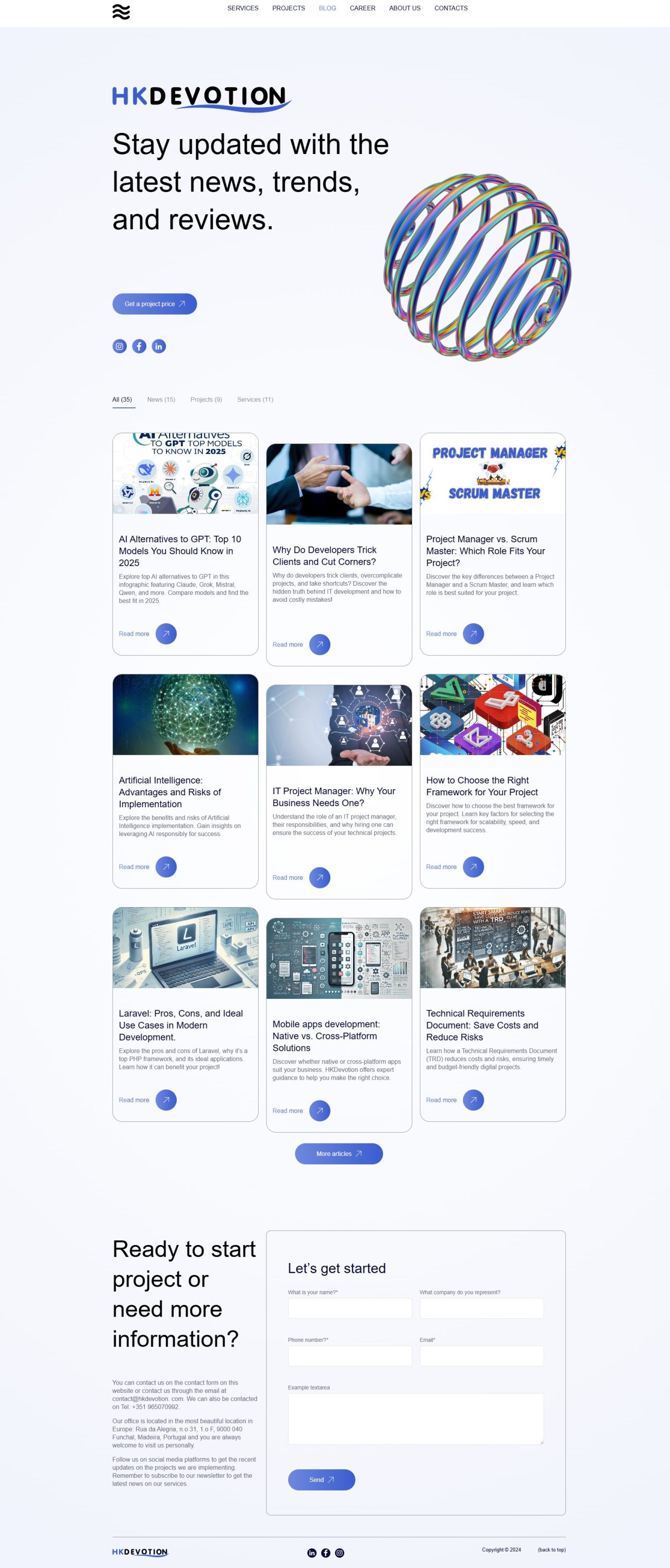
The final product is a clean, scalable, and technically solid website that represents HK Devotion’s philosophy: performance, structure, and clarity. The CMS backend allows the team to easily update content, and the frontend is fully optimized for performance across all devices.
If you’re looking for a fast, modern, and scalable corporate site — feel free to get in touch.
Development of the ProNavi Website: Technology, Design, and Innovation
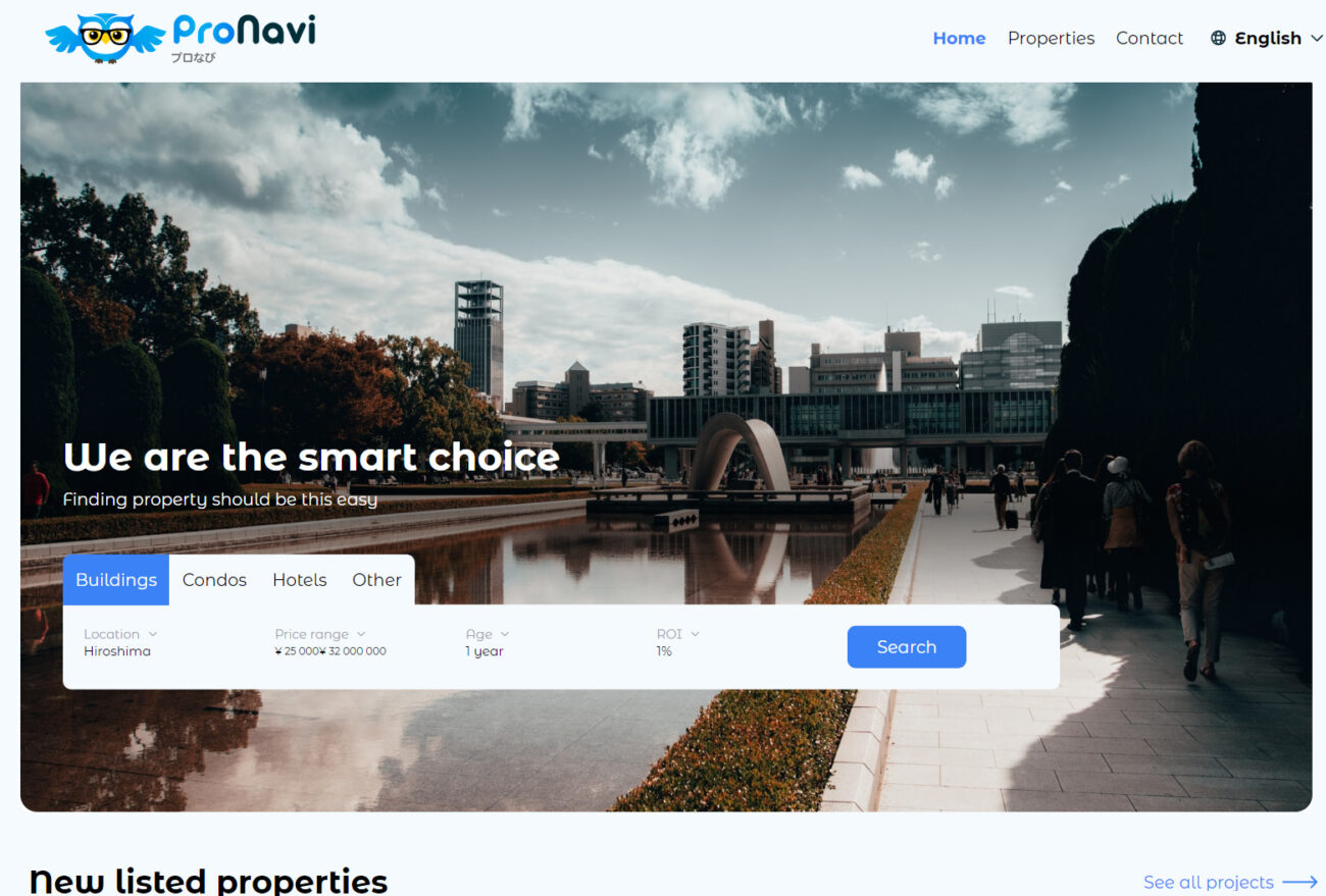
The ProNavi site represents a unique example of modern technology application in real estate. Developed using Laravel, Vue.js, Google Maps, Tailwind, HTML5, and JavaScript, the site stands out for its functionality and user interface.
Technological Solutions
- Laravel & Vue.js: The combination of these technologies forms a robust foundation for the site. Laravel ensures a reliable backend, while Vue.js brings interactivity to the user interface.
- Tailwind CSS: This framework is used to create a flexible and responsive design, easily scalable and adaptable to various devices.
Unique Features and Functionality
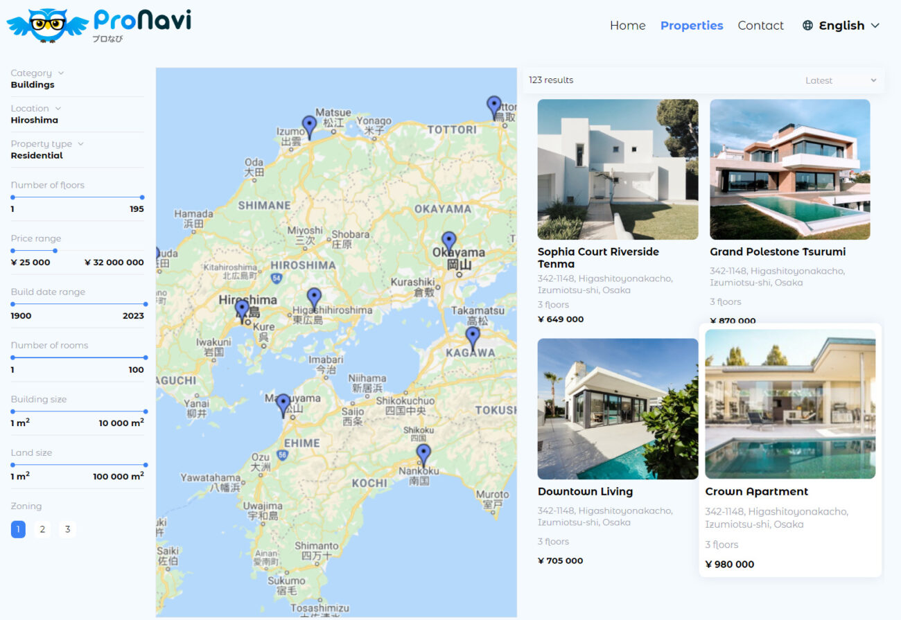
- Google Maps Integration: Provides users with an interactive way to view and search for properties, enhancing the visual component of the site.
- Search Filters: Allow users to easily find properties that meet their requirements, improving the user experience.
Interactivity and User Experience
- Interactive Map: Enhances site navigation, allowing users to visually explore different areas and properties.
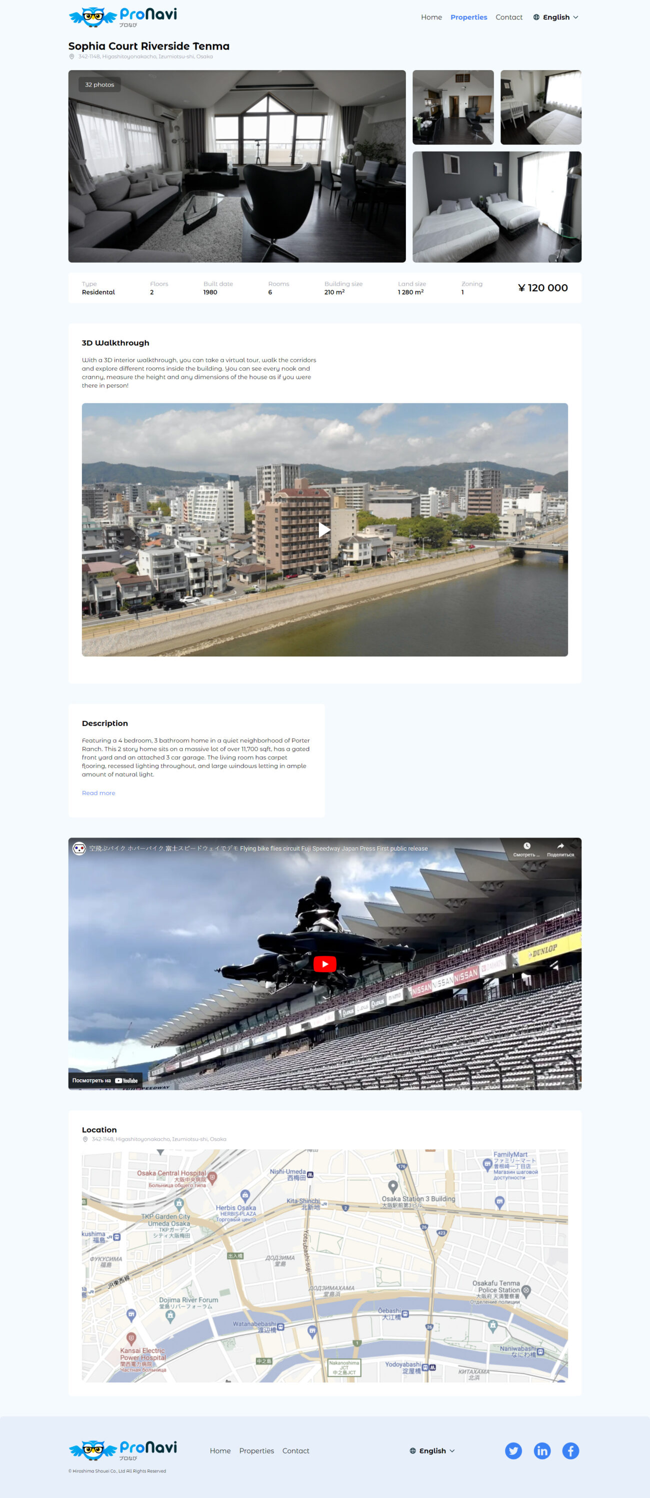
- Detailed Property Descriptions: Comprehensive information about properties, including photos and features, helps users better understand the offerings.
Contact Information and Feedback
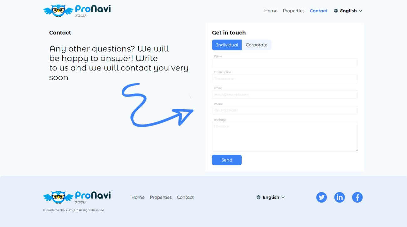
- ‘Contact Us’ Section: Offers various options for feedback, simplifying the communication process between site visitors and the company.
Conclusion
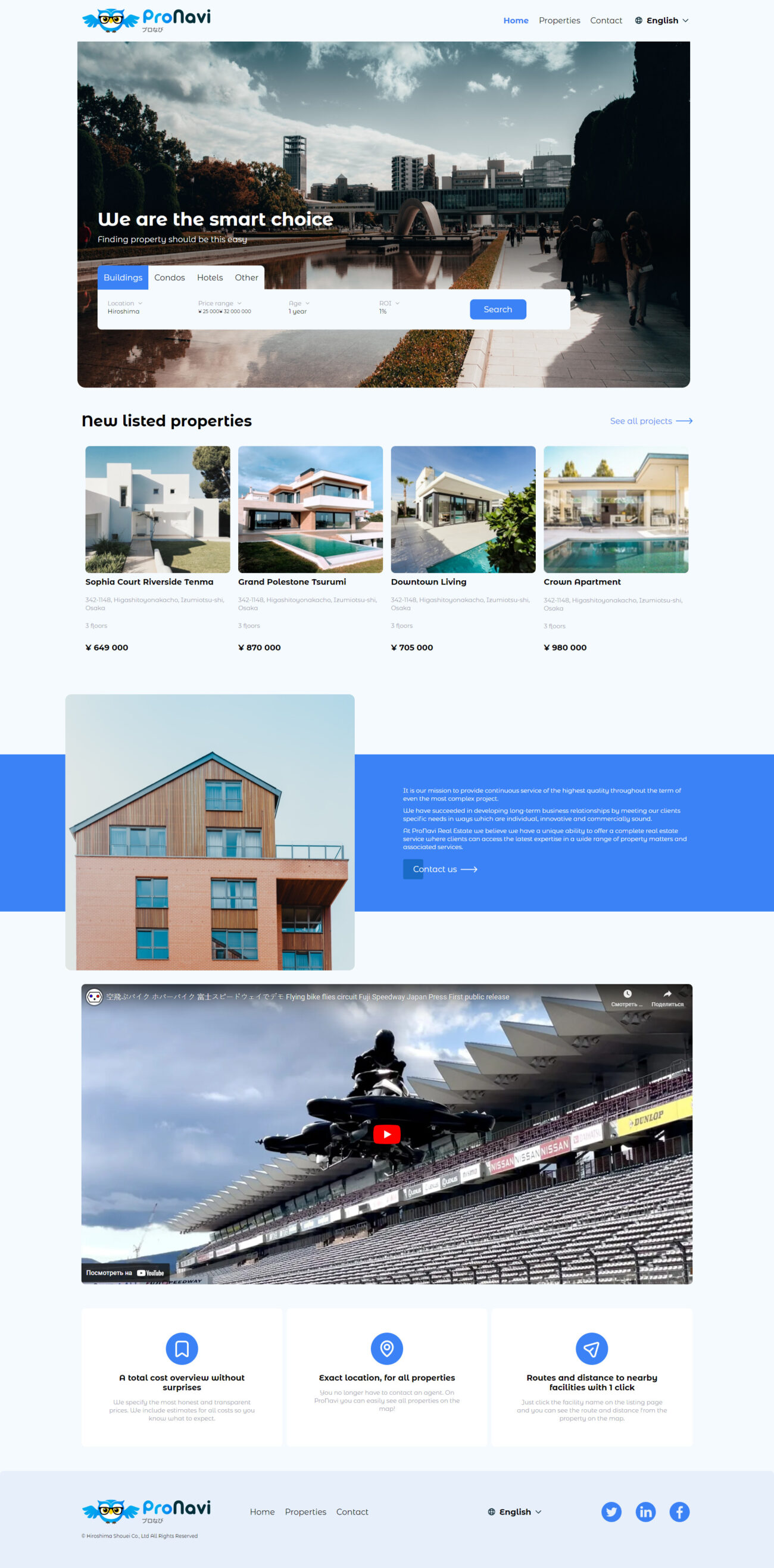
The ProNavi site demonstrates how modern technologies can be effectively used to create attractive and functional web resources in real estate. The site’s distinctive features include an intuitive interface, advanced search system, and data visualization, making it a valuable tool for users interested in the real estate market.
Development of the Klaxon Website: Diving into the World of Modern Restaurant Business
When our development team was tasked with creating the Klaxon restaurant website, we understood that this wouldn’t be just another project. Our goal was to design a platform that combined elegance, functionality, and user-friendliness.
1. Visual Design
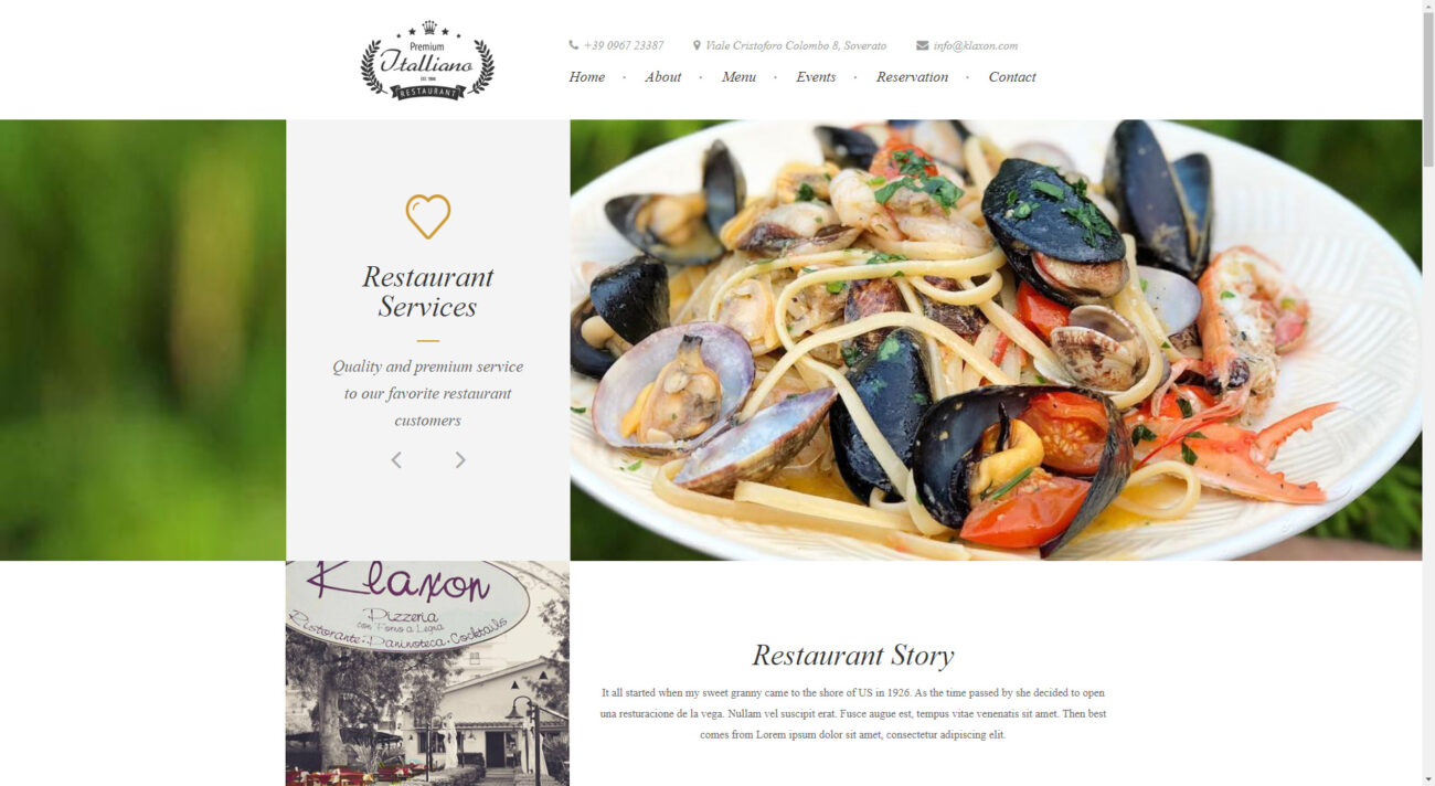
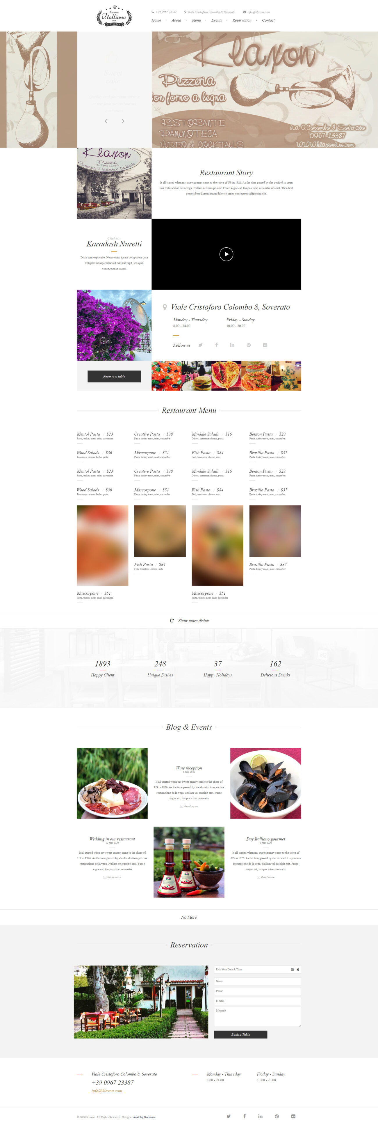
For Klaxon, it was essential to craft an interface that emphasized the uniqueness and quality of the dishes offered. We opted for a modern and minimalist design that focuses on the products and ensures intuitive site interaction.
2. Structure and Content
We concentrated on creating a clear and logical structure, highlighting key sections such as «Menu,» «About Us,» «Events,» «Reservation,» and «Contacts.» These sections provide all the necessary information, helping clients navigate the site quickly.
3. Features and Innovations
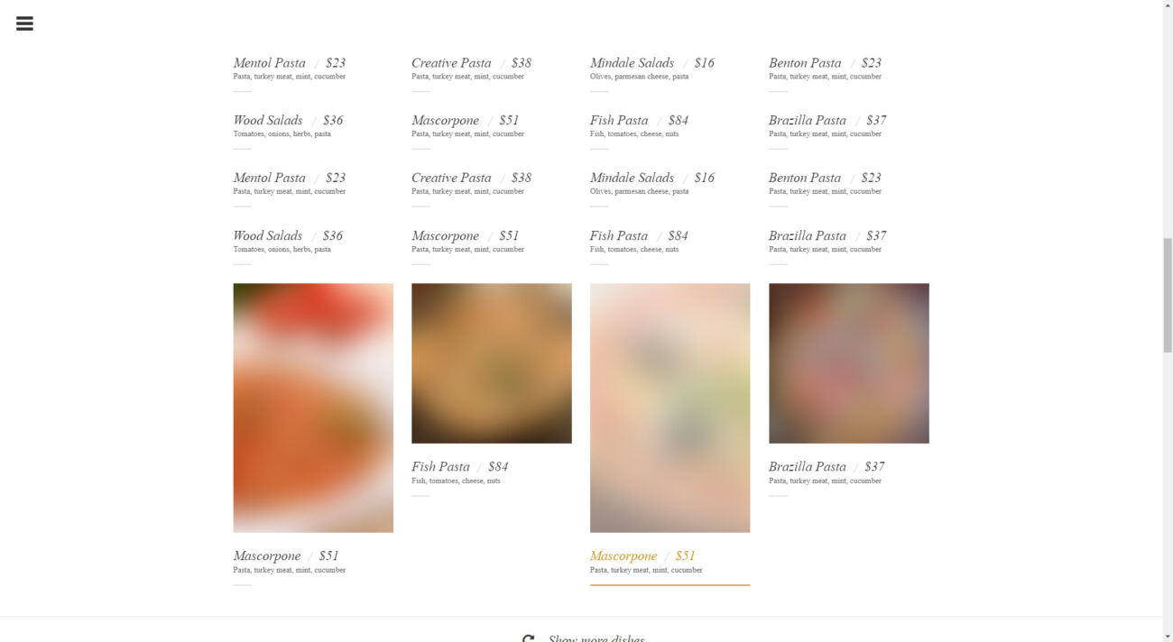
Special attention was given to the dish catalog. We developed a convenient and fast search function, allowing users to easily find the dishes they’re interested in, and provided detailed descriptions for each.
4. Contact Information
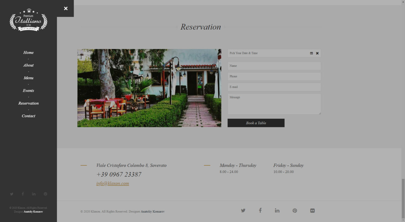
To ensure effective communication with clients, we designed a contact section, providing all the necessary information to connect with the restaurant’s managers.
Technological Foundation of the Klaxon Website: JS and Tailwind
In developing the Klaxon website, we employed modern technological solutions to ensure high performance and user convenience.
1. JS: Dynamism and Interactivity
Thanks to JavaScript, we designed a dynamic and interactive interface, ensuring smooth and rapid user interaction with the site.
2. Tailwind: Modern Design and Responsiveness
Using the Tailwind framework, we implemented a contemporary and adaptive design that looks great on all devices, be it computers, tablets, or smartphones.
Working on the Klaxon website was a genuine challenge for us and an opportunity to showcase our skills and expertise. We are confident that this site will offer users the highest standard of online shopping and will become an indispensable tool for those who value quality and convenience.
Development of the Anstel Online Store: Diving into the World of Modern Online Shopping
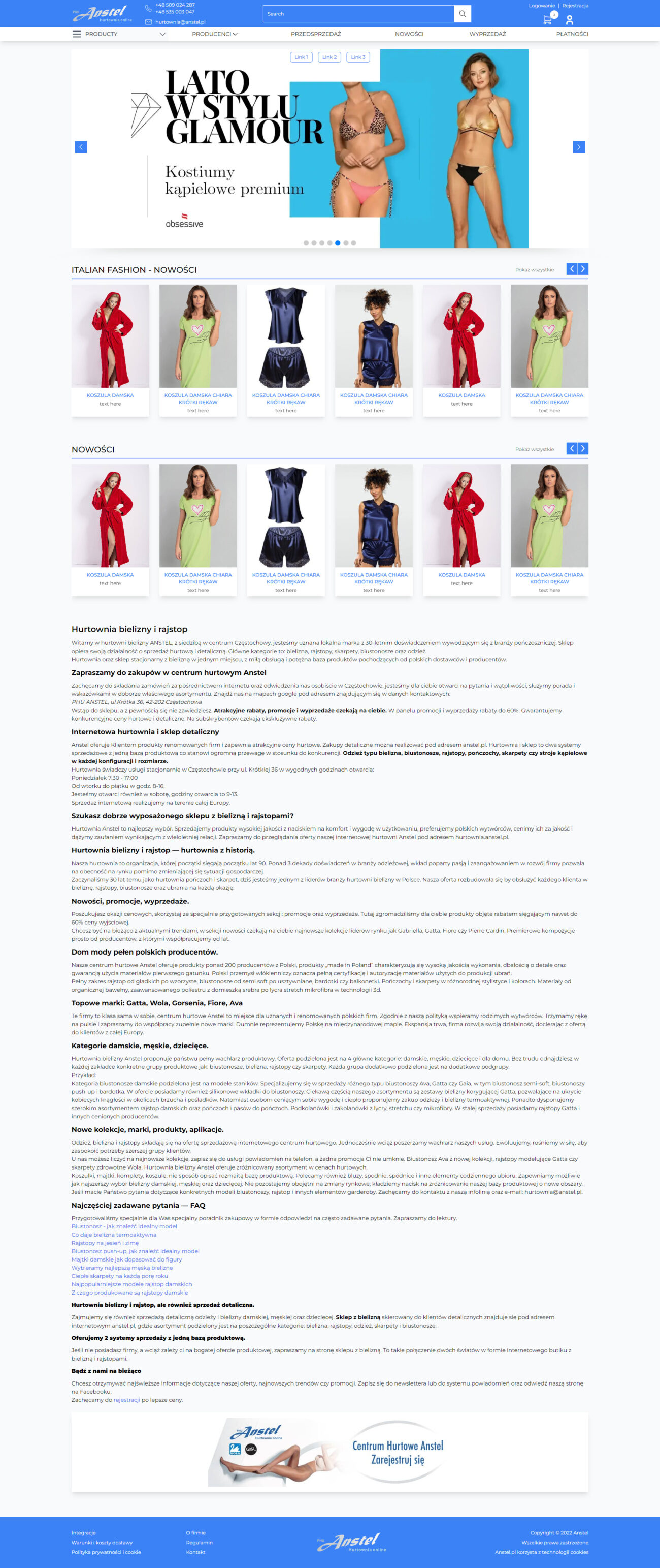
When our development team was tasked with creating the Anstel online store, we realized that this wasn’t just another project. Our goal was to design a platform that combined elegance, functionality, and user-friendliness.
1. Visual Design
For Anstel, it was essential to craft an interface that highlighted the uniqueness and quality of the products on offer. We opted for a contemporary and minimalist design that focuses on the products and ensures intuitive site interaction.
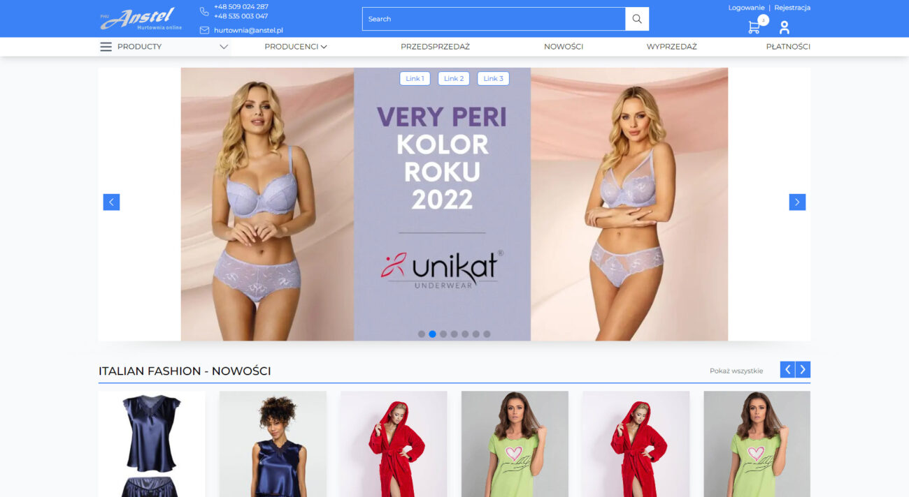
2. Structure and Content
We concentrated on creating a clear and logical structure, highlighting key sections such as «Catalog,» «About the Store,» and «Contacts.» These sections provide all the necessary information, helping customers navigate the site quickly.
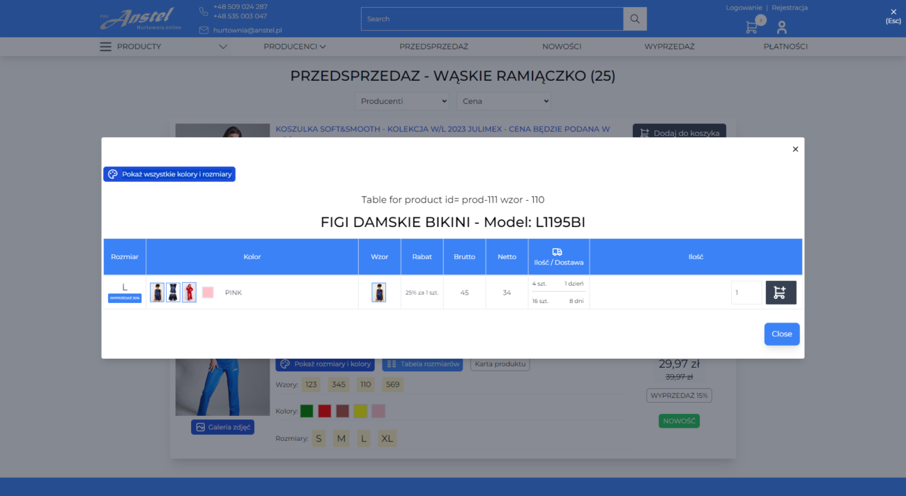
3. Features and Innovations
Special attention was given to the product catalog. We developed a convenient and fast search function, allowing users to easily find the products they’re interested in, and provided detailed descriptions for each item.
4. Contact Information
To ensure effective communication with clients, we crafted a contact section that offers all the necessary information for users to get in touch with the store’s managers.
Technological Foundation of the Anstel Online Store: JS and Tailwind
In the creation of the Anstel online store, we employed modern technological solutions to ensure high performance and convenience for users.
1. JS: Dynamism and Interactivity
Thanks to the use of JavaScript, we developed a dynamic and interactive interface that ensures smooth and rapid user interaction with the site.
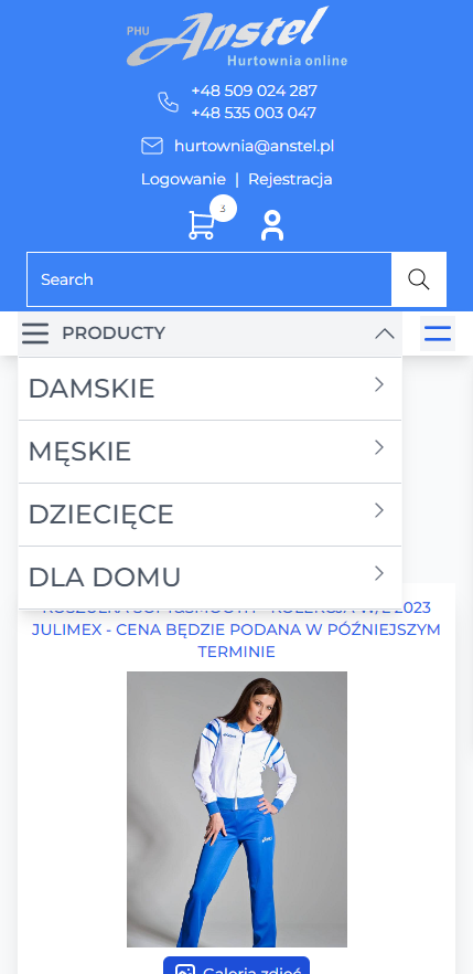
2. Tailwind: Modern Design and Responsiveness
Using the Tailwind framework, we implemented a contemporary and adaptive design that looks great on all devices, whether they be computers, tablets, or smartphones.
Conclusion
Working on the Anstel online store was a genuine challenge for us and an opportunity to showcase our skills and expertise. We are confident that this store will offer users the highest standard of online shopping and will become an indispensable tool for those who value quality and convenience.
Development of the Online Store: The Art of Crafting a Modern E-commerce Platform
When our development team was tasked with creating the online store, we understood that this wasn’t just another project. Our goal was to design a cutting-edge e-commerce platform that combined functionality, contemporary design, and high performance.
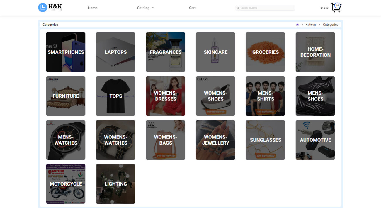
1. Visual Representation
For the online store, it was crucial to design an interface that reflected the dynamism and modernity of the products offered. We opted for a bright and minimalist design that emphasizes the products and ensures easy navigation.
2. Structure and Content
We decided to focus on simplicity and convenience, highlighting main sections such as «Catalog,» «About the Store,» and «Contact.» These sections provide all the necessary information about products and purchase conditions.
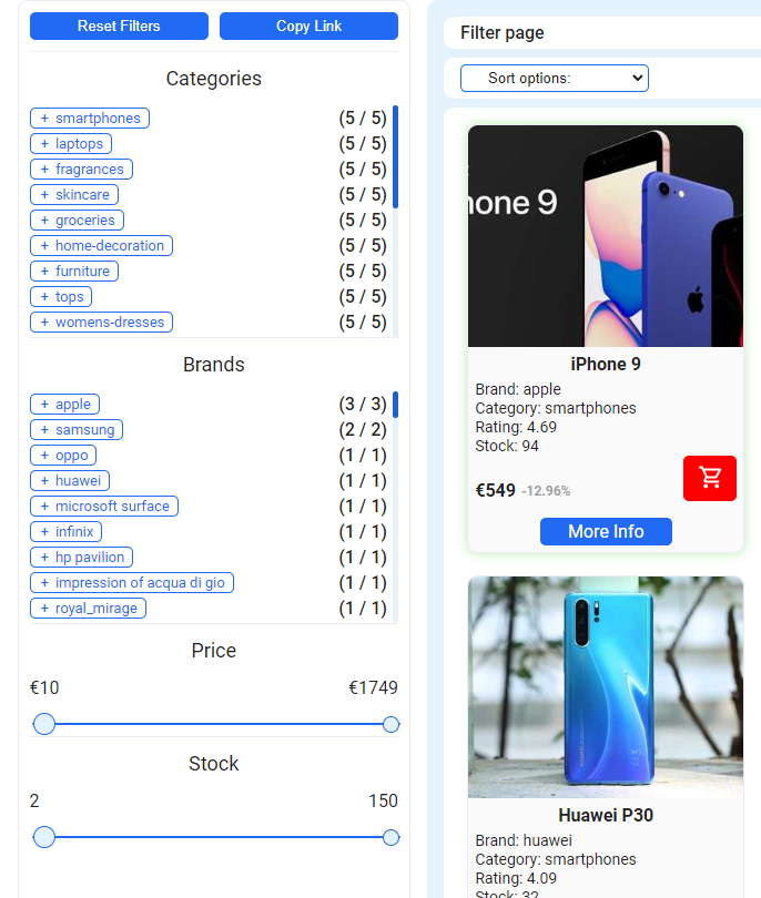
3. Features and Innovations
Special attention was given to the product catalog. Thanks to dynamic data loading, users can quickly and easily browse the assortment without compromising page load speed.
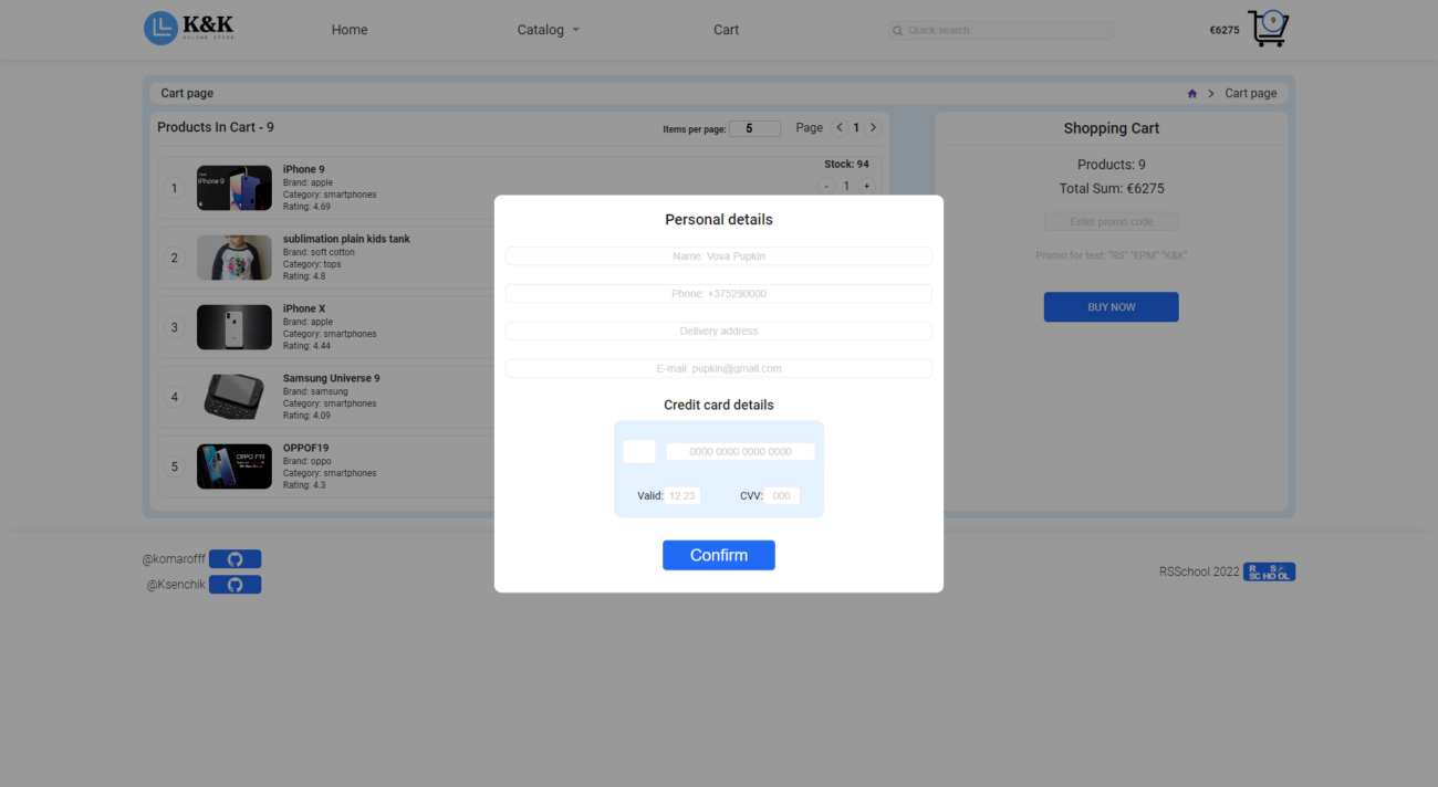
4. Contact Information
To facilitate communication with clients, we crafted a contact section that offers all the necessary information to connect with the store’s managers.
Technological Platform of the Online Store: Vue.js, vue router, vuex, TypeScript, and SPA
In crafting the online store, we employed advanced technologies to ensure high performance and user-friendliness.
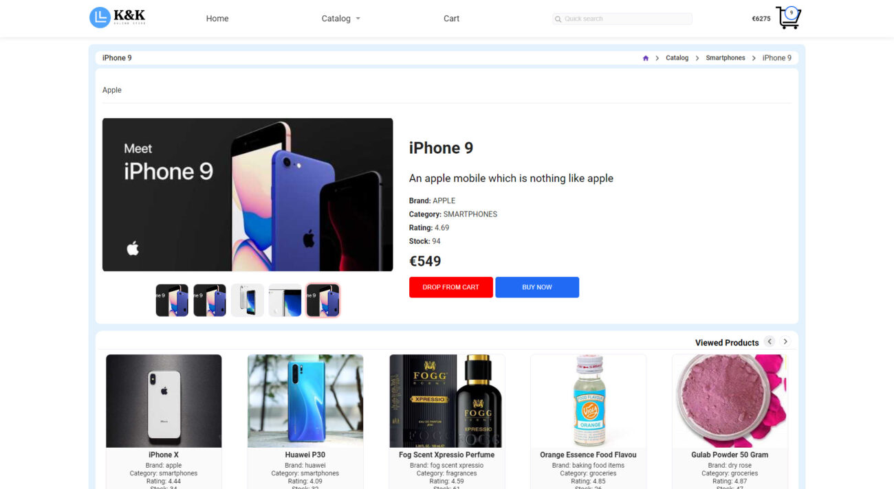
1. Vue.js and its Ecosystem
Using Vue.js and its tools, such as vue router and vuex, we created a dynamic and reactive interface that provides an instant response to user actions.
2. TypeScript: Rigor and Reliability
By utilizing TypeScript, we ensured strict typing and high code reliability, allowing us to craft a stable and secure application.
3. SPA: Speed and Smoothness
As a Single Page Application (SPA), the online store ensures rapid loading and smooth transitions between sections, making the shopping process even more comfortable for users.
Conclusion
Working on the online store was a genuine creative challenge that allowed us to apply the latest technologies and development approaches. We are proud of the outcome and are confident that this e-commerce platform will offer users the highest standard of online shopping.
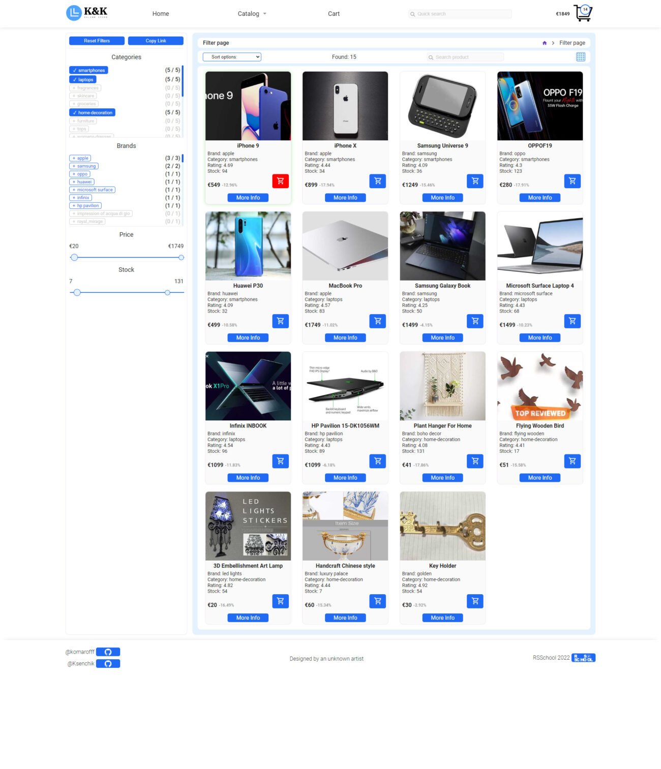
Development of B24Green.com: Delving into the World of Eco-Friendly Products
When our development team was tasked with creating B24Green.com, we realized that our goal was not just to design another online store. We needed to craft a platform that would embody the spirit and philosophy of B24Green — a company dedicated to selling eco-friendly products.
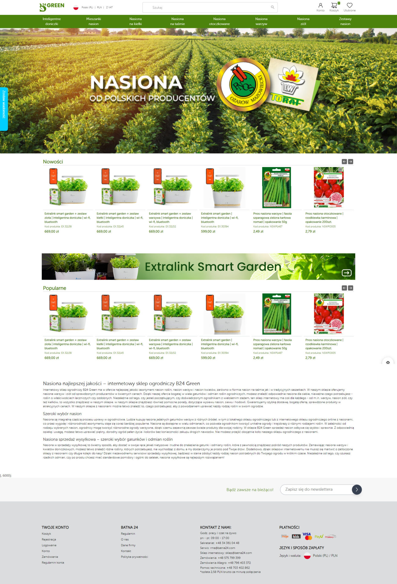
1. Visual Perception
For B24Green, it was essential to design a site that not only showcased their products but also conveyed their commitment to ecological purity and sustainability. We opted for a modern and minimalist design that emphasizes the quality and eco-friendliness of the presented goods.
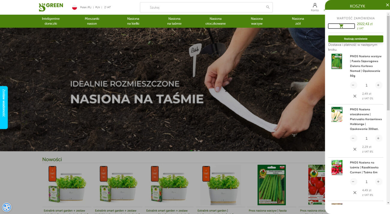
2. Structure and Content
We decided to highlight key sections such as «Products,» «About Us,» and «Contact.» These sections provide all the necessary information about the company’s philosophy, its products, and ways to connect.
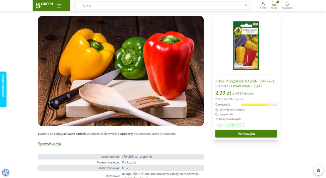
3. Features and Innovations
We paid special attention to the product section, presenting items with vibrant and high-quality images, and providing a detailed description of each product, its ecological characteristics, and benefits.
4. Contact Information
For a company like B24Green, maintaining close communication with clients is paramount. Hence, we crafted a contact section that offers all the necessary information for connecting with the company.
Technological Foundation of B24Green.com: JavaScript, TailWind, NodeJS, MongoDB
During the creation of B24Green.com, we employed cutting-edge technologies to ensure high performance, security, and user convenience.
1. JavaScript and TailWind: Dynamism and Style
With JavaScript, we were able to create a dynamic and interactive interface, while TailWind provided us with tools for crafting a modern and adaptive design.
2. NodeJS and MongoDB: Speed and Reliability
Using NodeJS as a server platform and MongoDB as a database, we ensured rapid site loading and secure data storage.
Conclusion
Working on B24Green.com was a genuine challenge and an opportunity to showcase our skills and expertise. We are proud of the outcome and believe that this site will become an indispensable tool for those who value eco-friendly products.
Development of BlackshipRealty.com: Behind the Art of Crafting an Elite Platform
When we, the development team, embarked on the creation of BlackshipRealty.com, we understood that we weren’t just tasked with creating another real estate website. Our goal was to capture the spirit and philosophy of Blackship Realty, a firm specializing in luxury real estate in Tokyo.
1. Visual Representation
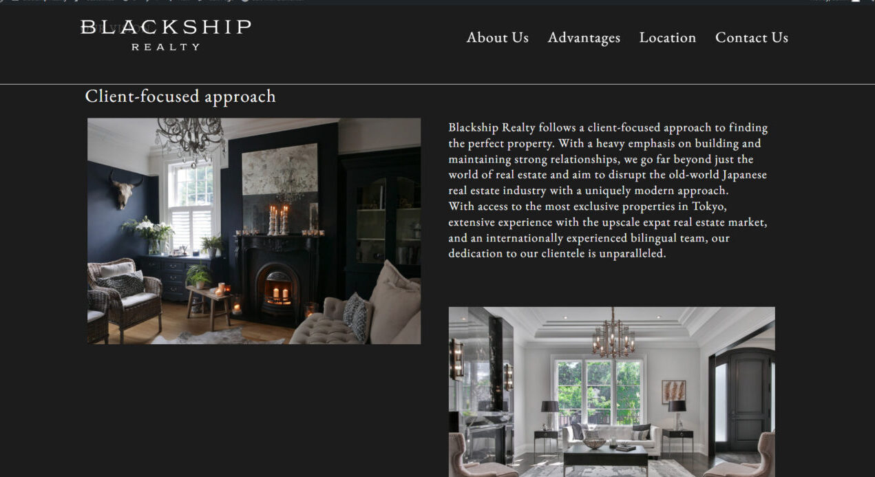
For Blackship Realty, it was crucial to not just have a website, but a virtual space that reflected their status in the world of luxury real estate. We opted for a minimalist design that emphasizes the properties on offer, focusing on high-quality images and a clear structure.

2. Structure and Content
We decided to emphasize the company’s exclusive offers by highlighting sections like «Available Properties» and «Market News». It was also important to introduce the team of experts behind Blackship Realty and their approach to work.
3. Distinctive Features
Blackship Realty doesn’t just offer properties; they provide an immersion into the world of luxury. We integrated virtual tour functionality, allowing clients to «walk through» properties before physically viewing them.
4. Contact Information
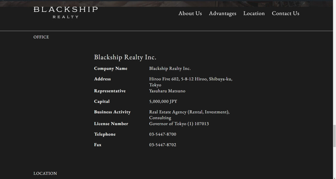
For a company dealing with luxury real estate, personal contact is essential. Thus, we paid special attention to the contact section, making it as accessible and straightforward as possible.
Technological Foundation of BlackshipRealty.com: WordPress and Elementor
In developing BlackshipRealty.com, we relied on time-tested and popular development tools — WordPress and Elementor. These platforms enabled us to craft a functional, responsive, and visually appealing site that meets the company’s high standards.
1. WordPress: The Site’s Backbone
Being one of the most popular content management systems, WordPress provided us with flexibility and a plethora of options to realize our ideas. With its help, we were able to craft a site structure that’s scalable and adaptable to various needs.
2. Elementor: Visual Realization
Elementor, in turn, allowed us to bring the site’s unique design to life. This visual editor for WordPress enabled us to craft intricate and creative layouts without deep coding knowledge. Thanks to Elementor, each page of BlackshipRealty.com looks professional, elegant, and aligns with the company’s corporate style.
3. Integration of WordPress and Elementor
The combination of WordPress and Elementor allowed us to craft a dynamic and interactive site. We easily integrated various features, such as virtual tours, interactive maps, and feedback forms, making the site as user-friendly and functional as possible.
Conclusion
Working on BlackshipRealty.com was both a challenge and an opportunity for us to showcase our skills. We’re proud of the outcome and believe that this platform will become an invaluable tool for those seeking luxury real estate in Tokyo.

Development of ParagonREA.com: Behind the Scenes
When we, the development team, began working on ParagonREA.com, our goal was to create a platform that would reflect the high status of Paragon Real Estate Advisors as a leading investment agency in Seattle, specializing in the sale of multi-family properties in the state of Washington.
1. Concept and Design
We wanted to design something modern, but at the same time, it had to reflect the professionalism and experience of the company. Therefore, we chose a clean and elegant design that emphasizes Paragon’s authority and expertise.

2. Main Sections of the Website
On the homepage, we decided to highlight key sections such as «About Us», «Our Services», «Available Properties», «Our Team», and «Market News». These sections provide all the necessary information about the company’s activities and current market trends.
3. Unique Offerings
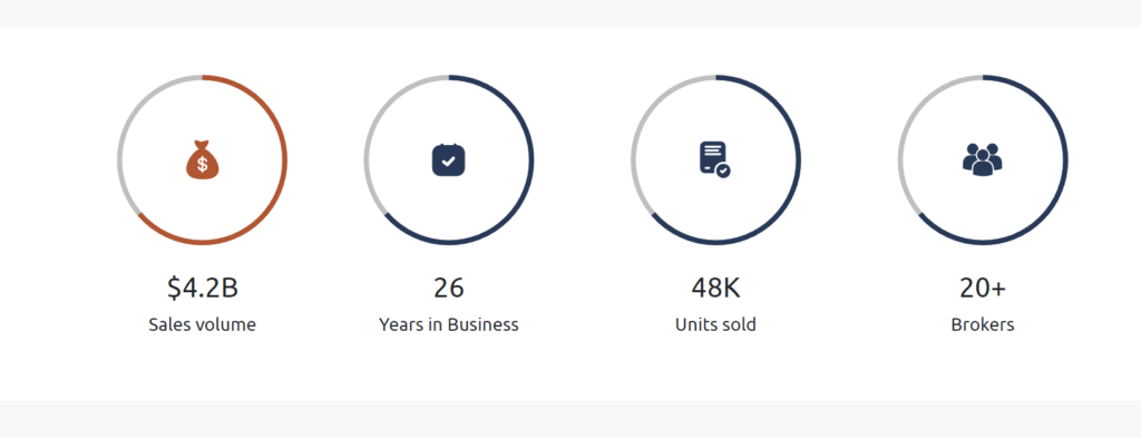
We are particularly proud of the «About Us» section, which tells what makes Paragon unique. Statistics such as sales volume, years in the market, number of units sold, and the number of brokers confirm the company’s authority and experience.
4. Feedback and Support
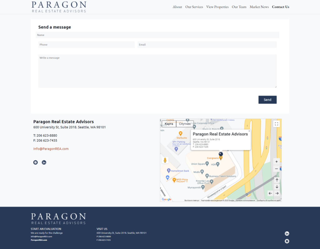
We also paid special attention to the contact section, providing all the necessary information to connect with the company, including address, phone, and email.
Technologies Behind ParagonREA.com
In creating ParagonREA.com, we used a range of advanced technologies, including WordPress, AJAX, and Elementor. These tools allowed us to create a dynamic, fast-loading, and responsive site.
Using WordPress, AJAX, and Elementor
WordPress gave us flexibility in content management, while AJAX provided dynamic interaction without page reloading. Elementor, on the other hand, allowed us to create a creative and responsive design without the need to write code.
Integration with Google Maps API: An Innovative Approach to Real Estate Selection
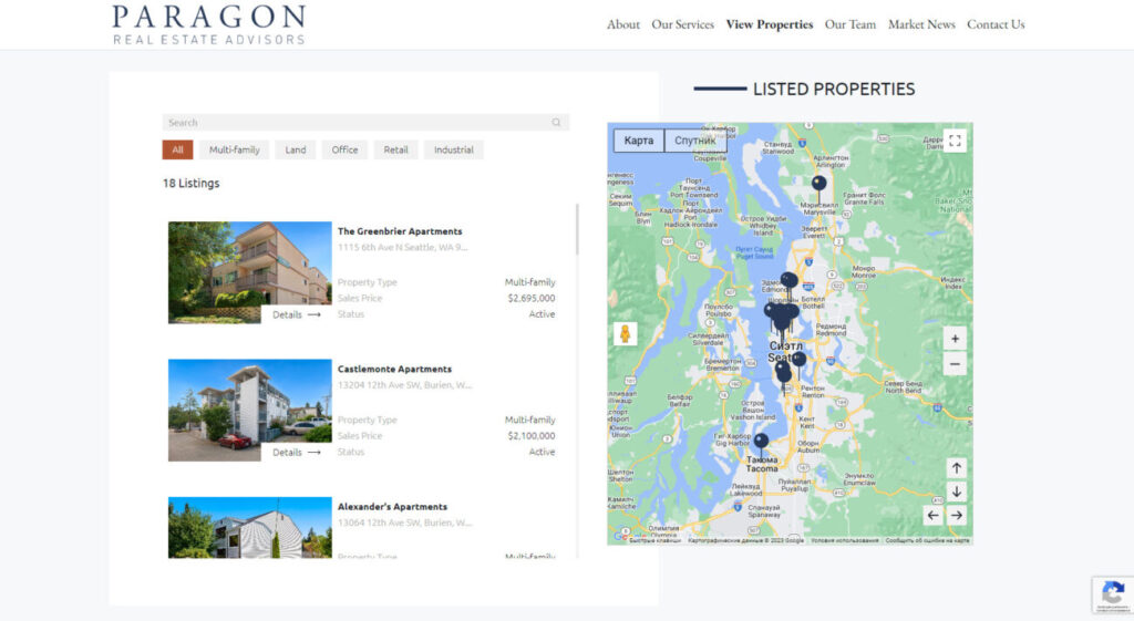
One of the key features we decided to implement on ParagonREA.com was an interactive map that allows users to view available real estate in real-time. This tool became possible thanks to the integration with Google Maps API.
Visualization of Real Estate Objects
Using the Google Maps API, we created a map displaying markers for all real estate objects listed on the site. Users can easily view properties in their area of interest, zoom in and out to get detailed information about a specific object.
Interactive Search
For user convenience, we added a filtering feature that allows objects on the map to be filtered based on various parameters such as property type, price, area, and others. This makes the search process even more intuitive and convenient.
Detailed Information on Each Object
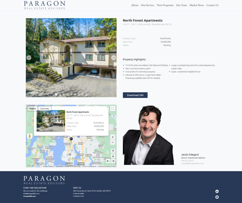
By clicking on a marker on the map, the user can see brief information about the object, as well as photos and main characteristics. If the user is interested in additional information or wants to contact an agent, they can go to the object page with one click.
Integration with Google Maps API allowed us to offer ParagonREA.com visitors a completely new experience in real estate selection. Now users can easily and quickly find the objects they are interested in, getting all the necessary information right on the map. This not only improved the user experience but also set ParagonREA.com apart from competitors in the real estate market.
In Conclusion
The creation of ParagonREA.com was an exciting process in which we, the development team, were able to apply our skills and expertise to create a high-quality resource for Paragon Real Estate Advisors.

Creation of the ImmunoHealth Website: From Idea to Implementation
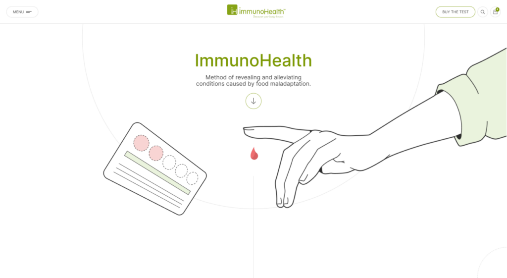
The ImmunoHealth website is a unique resource dedicated to the method of identifying and alleviating conditions caused by food maladaptation. The main goal of the website is to provide visitors with information on how food allergies and intolerances can affect health, as well as offer comprehensive tests to identify these issues.
1. Concept and Design
The creation of the website began with defining its main concept: providing information about food maladaptation and methods of its diagnosis. The site’s design was developed to be simple and understandable for users of all ages and knowledge levels.
2. Main Sections of the Website
The homepage of the website features main sections such as «What Makes Us Unique», «Symptoms and Conditions», «How It Works», and «Your Results». Each section contains detailed information about the offered services, testing methodology, and client testimonials.
3. Unique Offerings
One of the key offerings of the website is the ability to order comprehensive ImmunoHealth tests that help determine food intolerance and provide dietary recommendations. The site also provides information about Dr. Marina Rosenstein, PhD, CNS, the founder of the method.
4. Feedback and Support
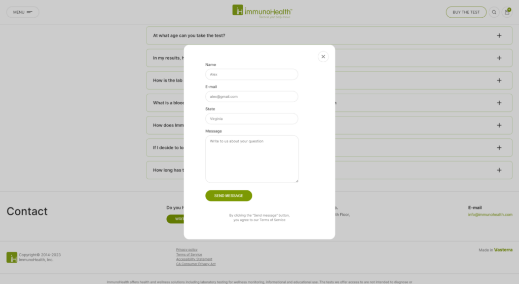
For those who have questions or comments, the website provides a feedback form. The company’s contact information, including address and email, is also provided.
When it comes to website creation, WordPress stands out as one of the most popular and versatile platforms. The ImmunoHealth website was developed based on this CMS, allowing the development team to work flexibly and efficiently on its structure and design.
Using WordPress
WordPress is a powerful content management system that offers a wide range of tools for creating and customizing websites. Thanks to a plethora of available plugins and themes, the ImmunoHealth team was able to create a unique and functional website that meets all user requirements and needs.
Technological Solutions
To ensure high performance and security of the site, various WordPress plugins and add-ons were used. This allowed for page load optimization, improved SEO, and protection against malicious attacks. Additionally, specialized plugins were used for integration with various services and platforms, such as online payment systems or social networks.
Responsive Design
One of the key points in creating a WordPress website is responsiveness. Considering that more and more users visit websites from mobile devices, it was essential to ensure the correct display of the site on all types of screens. Thanks to the use of modern themes and frameworks, the ImmunoHealth website looks equally good on both computers and mobile devices.
Overall, using WordPress as the primary platform for creating the ImmunoHealth website allowed the development team to implement all planned ideas and functionalities, ensuring high quality and convenience for users.

Conclusion
The ImmunoHealth website is a prime example of how informational resources and services can be combined to help people improve their health. Creating such a website requires a deep understanding of the topic, as well as the ability to present complex information in an accessible and understandable form.

Task
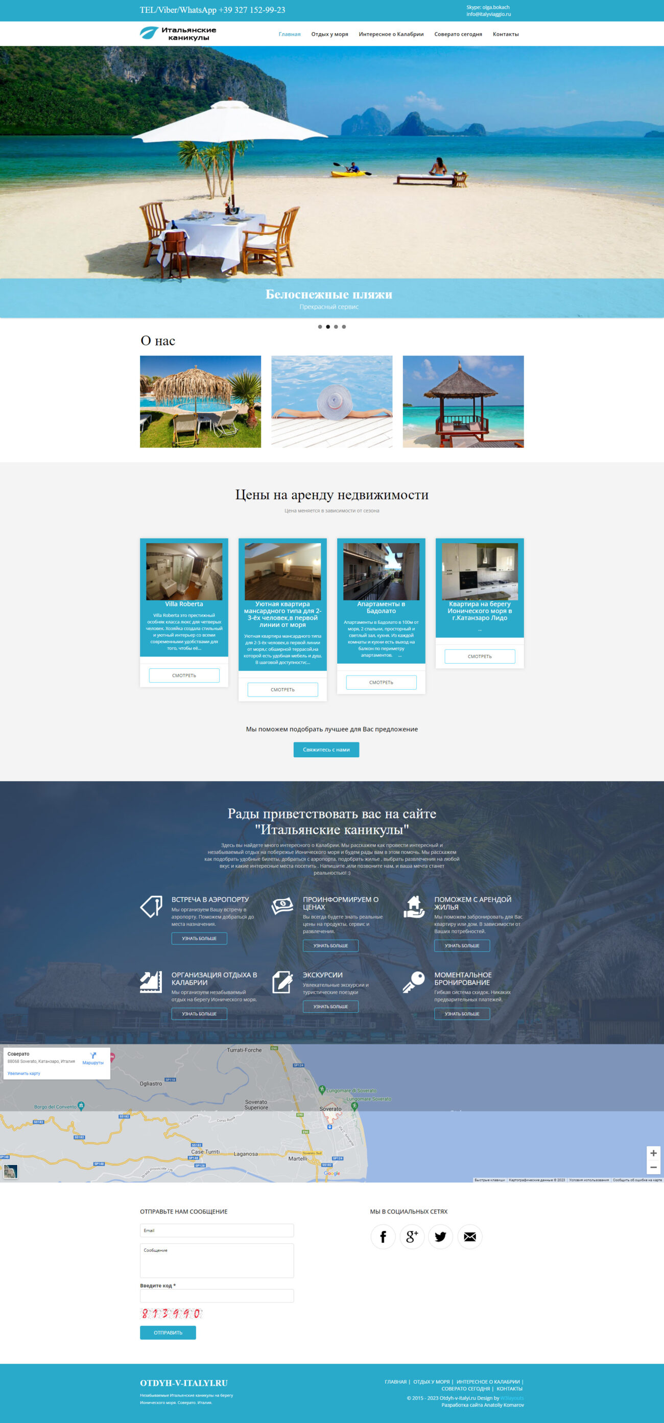
Italian rental housing on the WordPress platform
In 9 days we created a simple and easy to use website for renting apartments. We built it on the well-known WordPress management system.
Objectives
To create a website based on WordPress for renting apartments in Italy. The client had the following requirements:
-Availability of a feedback module for making an application;
-Accommodation booking filter with a specific set of conditions;
-An admin panel integrated with the WordPress management system.
In addition, it was necessary to connect the website and the CRM system to control and improve sales.
The Solution
The site was developed using the latest technologies, namely HTML5, CSS3, JavaScript, jQuery, PHP7 and Mysql and WordPress.
With their help developed:
A clear and easy-to-use admin panel based on WordPress.
An accommodation booking module with filters, which greatly simplified customer selection and took the load off the consultant.
Feedback module for receiving a delayed consultation.
A photo gallery for the demonstration of real apartments.
In addition, the website was adapted to different devices and browsers.
Result
In the shortest possible time we made a simple and convenient website for receiving applications.
Project team: designer, developer, project manager
Lead time: 73 h/9 days
ONLINE STORE. ELECTRICAL GOODS SALES WEBSITE
Task
Online store. Online trading system for the sale of electrical goods
Within two months we built an online trading system for selling electrical goods. The project was implemented on the basis of outdated site with the catalog of more than 10 thousand items.
Objectives
To create online store selling electrical products on the basis of outdated site. The client needed the following modules and features:
-A personal account for making an order;
-A list of viewed and recommended products;
-a shopping cart for placing an order;
-admin panel to work with the catalog;
-Website integration with 1C (trading system)-to keep track of prices and quantities of products.
Given list — this is the standard for online stores. The complexity of the work consisted in the large catalog (more than 10 thousand items) and the fact that the customer wanted maximum automation of the processes.
Solution
The work on the website was based on the latest technologies such as HTML5, CSS3, JavaScript, jQuery, PHP7 and Mysql.
With their help we developed:
Administration panel for catalog operation.
User’s account with personalized offers, i.e. prices on the site changed according to the customer’s discount.
A list of the viewed and recommended (similar) products in the bottom of the site.
The product card with a list and prices of the entire line.
Shopping cart for sending selected products to the 1C system for creating an order and reserving a product.
To maximize automation of the process for the selection and sale of goods, the connection site and the 1C system was set up online.
Result
All the planned project was fully realized. As a result, orders are automatically generated and prices on the site are updated. Thus the superfluous workload was taken off the managers, and customers got an opportunity to purchase quickly and easily.
Project team: designer, developer, project manager.
Lead time: 385 h/48 days

